Tuesday 17 December 2013

Animated Logo Design

For this assessment an animated logo is required, and is also something that will help develop branding and identity across all of my design and animation work. The logo will form the basis for branding design on the portfolio article too.

The logo is the first thing that will be seen on the article and the video, and is therefore something that will set the tone and precedent of my work. I intend to use flat design, with relatively minimal style.


As you can see from the finished product above, the design is minimal and simplistic, with no intention of being over-complicated. This is to ensure a clear image to represent my work and not be too complex.

For this piece I used Adobe After Effects CC which allowed me to utilise animation and layer control. The animation aspect was relatively basic, however it achieved the style that I desired. Two slightly transparent blue circles collide, which is achieved by key-framing the position details of the circles, then a white layer flashes over the screen, revealing the text on top of the circles. The flash is achieved by key-framing the opacity of a white shape over the whole composition, from 0% to 100% and then back to 0% in quick succession.

The font used for the title is Trajan Pro, an all caps serif font. I'll also use this font for the article design, to continue the branding over multiple pieces of work.

The next post will be the last post for this project, containing the final video and the design development for the article.

Thursday 12 December 2013

Colour Correction and Motion Tracking

With my footage and artwork prepared, it was time to bring everything together in After Effects. You can see the composition settings that I created for the animation piece below.


These settings match the settings with which the footage was shot. 20fps isn't ideal, however that's the camera has given me, so that's what I'll be working with. 

The first step was to add some colour correction to the footage, to enhance the visual quality. Below you can see where I have increased the saturation and master lightness, as well as adding and adjusting some curves. This adjustment layer has been applied to all of the footage to ensure a consistent overall finish. 


After this it was time to motion track the footage, such that the birds can be placed into the scene. Using the built-in tracker function I tracked the motion for all the scenes that I intended to use, and applied the movement to a null object which the birds can be parented to at a later stage. I also added letterbox to the footage, to add a slightly cinematic aspect to the footage. It also gave me some more control over the framing of the footage, allowing me to trim some of the footage under the letterbox.


This shot shows the adjustment layer, letterbox and now motion-tracked bird all applied to the first shot of the animation. The next step is to animate the wings of the birds, and add a flight path across this show. To animate the bird I opened it in a separate composition and began manipulating the different layers. 

Click the image to see an enlarged version

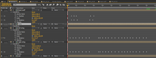
This image displays the keyframes used for animating the red bird. (Note: the composition is called 'birdrast' as initially I forgot to rasterise all of the layers).

Once this had been completed, I added the movement path to the scene in which the bird begins, to add the impression of flight and movement. The animation is quite simple, focusing on using a variety of skills. I also added a CC Force Motion Blur to the bird, so that when it flies across the screen the motion blur can add the sense of dynamic movement. 

This process was applied to all other scenes in which it was needed. 

For the last shot, the red bird flies in and sits on a branch with the blue bird. For this to work I needed to mask the branch which they were both sitting on, however one small detail was the need to place the feet of the birds over the branch to give the impression they are sat on the branch. To do this I have duplicated the footage, then masked the branch over the top of the other footage, then placed the birds between the footage layers. The image below is a frame from the final scene of the animation, and the orange outline indicates where the mask is. 


Since the footage is not static I have had to animate the mash path to ensure that the branch is the only thing masked throughout the footage. The keyframes are shown in the image below. 


With this stage of the animation complete, the next stage will be to complete an animated logo and then to compile all of my work into a digital portfolio in Adobe InDesign CC.


Just a couple of old birds

For my video I have filmed some footage in and around my house with the intention of animating a parrot to fly around. There is also a shot on which I will add motion tracked text.

But for this post I will show you the progression for making the parrots that will appear in the video. Using Adobe Photoshop CC I created all the layers of the bird from scratch. I used the pen tool, among other shapes, to create everything I needed. Once all the shapes had been created I added the desired colours to ensure the parrots were colourful and fun. You can see the progression from just the body to the finished bird below.


With this layer I created the body. I used the brush tool to add a soft edge around the outer edge of the body, which adds a little texture and depth. Another detail added was the ruffle on the front, which ensured that the body wasn't just a plain front. The next step was to add the head. 


Initially the eyes had white circles around the outside, however after some comparison I decided that the smaller black dots worked better within the cartoon context of the animation. The beak is split into two separate layers to ensure that at the animation phase I can move both parts individually. After this I added the wings. 


The wings have been layered and duplicated to add some symmetry to the bird, and to ensure the wings are the same size. The colours used are generally primary colours, or close to, continuing the theme of cartoon stylisation. At this point I felt there was something missing from the bird... a tail! 


I used the same shape generated for the feathers in the tail, but rearranged them and altered the colours. The spread of tail feathers suggests movement, which will enhance the visual appeal of the bird whilst flying in the animation. Yet again my limited knowledge of parrot anatomy failed me, the bird is missing feet. 


After a quick Google I realised what sort of feet I needed to draw, and then generated the feet accordingly. The feet are important at this stage as they will sit on top of a branch, so making sure that the layers are organised sensibly will save time later on in the creative process. I also used this bird as a template for another bird, which in the animation will meet the first bird. 


These birds will be the star of the show. 


Above you can see the organisation of layers within Photoshop. These layer folders will transfer to Adobe After Effects, meaning I can locate and animate the bird with much less hassle. 

The next step is to bring these files into After Effects CC and animate the bird. I will also need to colour correct my footage to make it look nicer, and more suited to having a cartoon bird flying around. 


Convergence Development

For the last couple of weeks, I've been working on a convergence task to submit before Christmas. The assessment requires me to demonstrate some of the skills I have learnt and developed over the first semester, including motion graphics which I intend to focus on. This is an individual task, and all work for this assessment has been made from scratch.

For the piece I intend to motion track a parrot flying to find his friend in a nearby tree. This concept is simplistic, to ensure that the motion tracking isn't too complex and can be achieved within the timeframe. The finished video needs to be submitted in an article created in InDesign, and completed by the 13th of December.

My initial idea is to have a small bird flying around outside looking for another bird, a simple animation to show my ability to manipulate different layers of artwork, as well as apply motion tracking and masking.

The next few posts will show the development of the artwork and the animation, up to the point where the project is ready to be submitted.

Tuesday 5 November 2013

Front Page Development

With the logo finished, and a rough concept of the layout we want, we began developing the pages to be used in our app. 

The areas of focus within the app were decided upon, and I developed a front page for the app, which doubles as a topside contents page. 

Using the logo developed in the last post, I expanded upon the page. Using the font 'Quicksand' (which was also used for the tagline) I created a menu system underneath the logo. 

The final front page can be seen below. 


Each option on the front page can be tapped to open a smaller sub menu, offering more specific areas within each topic of the fitness app. The other options open up from within the green rectangle which encases the first option. The drop down will push the other rectangles off the page, or under a fade around the logo. An example of the expansion can be seen below. 

Apologies for the odd colour of this image.
This is the front page that will be used for our app.

Early Page Design

Now the branding of the app has been decided, we've begun designing the UI. 

To the right you can see an early logo design, using the Amatic SC and Amatic fonts. We liked the concept of having different thicknesses of font within the logo, highlighting the fitness part of the name. At this stage of development, the name had not yet been decided upon. 


During this stage of development, a tagline was generated for the app, summarising our desire to be the only fitness app on the market, reinforcing our concept of an all in one app. 'The only app you need'. 

To incorporate this tagline, a small ellipse was added to the title bar, adding a dynamic aspect to the logo. The round shape was something we liked, and decided to work with more. 


Continuing to develop the logo, the ellipse was extended to create a smoother shape on the bottom of the logo, which could then be involved with the rest of the app. 

On other pages, the idea is to use the bottom of the ellipse at the very top of the page to be a home button, of sorts. When tapped a drop down will appear offering more options and navigation. 


At this stage the name was added to the design process, also taking advantage of the font thickness switch that occurred in the previous iteration. The thickness switch was done to generate focus on the word fit, highlighting the topic of the app. 

At this stage the ellipse was shortened again, however this is something that was still open for debate.


As a completely left field suggestion, we tried using a circle, only partly visible off the top of the screen. This dynamic shape was an immediate improvement on the previous generations of logo design. The round shape would also work perfectly in retracting to the top to act as a drop down home menu system. 


Once the logo was resized for phone display resolution ratios, we noticed that excluding the edges of the ellipse at the top worked well in the design of the app. 

This is the basis for page design, which will be expanded upon in the next post. 


Branding, Fonts and Naming

As we move closer to the submission for this fitness app design project, it's time to start constructing the UI. After we chose the colour palette to work with, it was clear that the style we were intending to go for was to appeal to a unisex audience. 

Font design was something we considered while continuing to develop the brand identity of this application, and noticed that in tandem with the light-hearted and muted colours that a fun and cursive font would work for the logo. We also decided that we wanted a logo that contained no 'pop art' or representative artwork, and opted instead to have a text based logo, with the words being the focus. 

Since our name will be the focus of the logo, our app name is even more important than it would be normally. After some online research we discovered a number of fonts we liked in the cursive style, including fonts called 'The Hand' and 'Amatic', which became the front runners. Due to a funding issue, 'The Hand' was unavailable to us, and so the decision was made to use Amatic and Amatic SC. You can see those below. 

Amatic SC, Amatic


As you can see from the image, a name has been decided for the application. 

'Perfect Fit' was chosen from a shortlist of names, including 'Fitness Fun' and 'Fit for All'. The name was chosen due to its broad coverage of the topic, as well as being a play on words. 

With the colour scheme chosen in the previous post, and now the font decided, the page design can begin. 

Saturday 2 November 2013

App Design Progression

As mentioned in the previous post, the target audience for this app is broad. Whilst aware of the possible downfalls of broadening the target audience, as a group we feel it is the best way to develop the best possible fitness app. 

To achieve this we considered the different approaches that were available to us. Muted colours and flat design was something we quickly decided was in fashion, and therefore something we wanted to use for our design style. 

An example of good flat design is the iOS 7 interface (image below), which moved from an embossed and reflective style to flat colour style with no lens flare. iOS7 also moved away from aspects of skueomorphism, to a consistent flat design across all native apps. 


Learning from Apple's design style, we've decided to employ this in-vogue format within our design. 

Colour is an important aspect of design, and something we want to consider before committing to a theme and moving forward with the design. Below are some of the colour combinations that we considered, before choosing which we liked the most and moving towards early UI design. 


These colour samples all include muted, almost pastel like colours, with a range of connotations. The first sample is more focused towards a masculine audience, with richer colours more generally associated with men. The second seemed a little feminine, and therefore the third sample is the one we will be using for our app.

For the next post we'll be generating more of the branding and identity. 

Tuesday 29 October 2013

Strava - Competitor

Strava Logo

Fitness apps are known to be highly motivational, however the app Strava has been under fire for encouraging reckless exercise. 

The app, which can been found here, has received criticism for pitting its users times against each other with the intention of encouraging the user to try and beat the best time for a particular route. The Guardian recently wrote that Strava may be 'tacitly egging on subscribers to cycle recklessly', which is certainly drawing negative attention from the national press.

Learning from the mistakes of Strava, leader boards are not something to include to avoid the encouragement of reckless exercise, which may endanger the user or those around them. 

The design of the app, however, is strong with a consistent branding style across all aspects. Orange is a dominant and prevailing colour, applied to every page that the app contains. 

In the picture to the left you can see the consistency of design, including some vibrant and intuitive ways to present the information that the consumer may require.  One thing that stands out from some research into the app is that the information is presented simply, with graphics and a simple grid system. On the other hand, the design style seems fundamentally masculine, with dark strong colours being the focus. 
For a fitness app to appeal to both genders, which is something I feel our app should do, then finding a sweet spot in unisex colours that will not offend either gender is important. Demographically, fitness transcends age groups as well as gender, so another aspect of the app should be that the app appeals to as many people as possible. Our target market will be all those interested in fitness and self improvement. 

Things to take from this competitor in the fitness market include the importance of encouraging sensible exercise that can still enhance the lives of the users, a sensible and market specific design style. 


Tuesday 22 October 2013

Digital Media App Design - Initial Research

I've been tasked with designing a digital media application to solve a real world problem. In a small group; we will choose a topic, research the market and then design the product for an appropriate audience. The topic was chosen from this list of options: 
  • Energy Consumption
  • Personal Budgeting
  • Food / Water Waste
  • Fitness
  • Commuting
  • Local Government
  • Education
As a group we decided to design an app for the fitness market. Whilst aware of the volume of fitness apps on the market, we concluded that there was no 'perfect' app, offering a range of functions in one well designed and easy to use product. 

A discussion within the group highlighted certain aspects of existing fitness apps that we feel could be improved. An example of this is EveryMove, an app designed to reward the user for simply moving and staying active, not necessarily exercising. While this seems like an attractive idea, as fitness apps go it is fairly limited. There's no particular plan or suggestions for activities to do, and the interface seems dated and socially focused. A link for the app is found here.

Lessons to take from this app is to ensure we have a fresh, attractive and functional design, while offering a strong and multifaceted service. 

For reference, find my colleagues blogs at the following links:

Thanks, 

Alex