| Strava Logo |
Fitness apps are known to be highly motivational, however the app Strava has been under fire for encouraging reckless exercise.
The app, which can been found here, has received criticism for pitting its users times against each other with the intention of encouraging the user to try and beat the best time for a particular route. The Guardian recently wrote that Strava may be 'tacitly egging on subscribers to cycle recklessly', which is certainly drawing negative attention from the national press.
Learning from the mistakes of Strava, leader boards are not something to include to avoid the encouragement of reckless exercise, which may endanger the user or those around them.
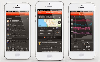 In the picture to the left you can see the consistency of design, including some vibrant and intuitive ways to present the information that the consumer may require. One thing that stands out from some research into the app is that the information is presented simply, with graphics and a simple grid system. On the other hand, the design style seems fundamentally masculine, with dark strong colours being the focus.
Learning from the mistakes of Strava, leader boards are not something to include to avoid the encouragement of reckless exercise, which may endanger the user or those around them.
The design of the app, however, is strong with a consistent branding style across all aspects. Orange is a dominant and prevailing colour, applied to every page that the app contains.
 In the picture to the left you can see the consistency of design, including some vibrant and intuitive ways to present the information that the consumer may require. One thing that stands out from some research into the app is that the information is presented simply, with graphics and a simple grid system. On the other hand, the design style seems fundamentally masculine, with dark strong colours being the focus.
For a fitness app to appeal to both genders, which is something I feel our app should do, then finding a sweet spot in unisex colours that will not offend either gender is important. Demographically, fitness transcends age groups as well as gender, so another aspect of the app should be that the app appeals to as many people as possible. Our target market will be all those interested in fitness and self improvement.
Things to take from this competitor in the fitness market include the importance of encouraging sensible exercise that can still enhance the lives of the users, a sensible and market specific design style.
No comments:
Post a Comment