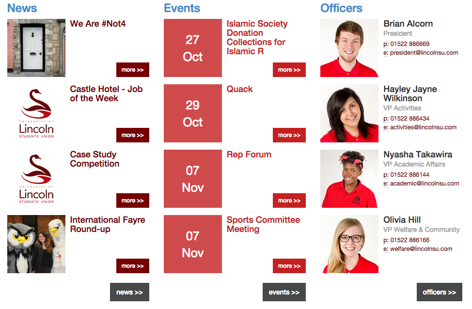
As you can see, the Lincoln Students Union website is a little muddled. The layout and formatting is inconsistent in places, and even unfinished on one of the pages.
For a mobile application, the design will need to be much smoother and more refined, with ease of control in a touch interface also being a key touchstone. The colour scheme and logo design are already strong, however it is the formatting that needs revitalising. With this in mind, I have put together some very rough early stills for what the app might look like.
Given that most applications start with a basic splash screen that animates into the main menu, I have put together what different splash screens may look like.

All the designs have taken the swan as the main image, but in different forms. The first splash simply uses the swan alone, whereas the second takes the whole logo including the text and a further enter command. The third and final splash is my current favourite at this moment in time, with the inverted swan on a simple rectangle. Upon loading, the app would then animate through the red rectangle and reveal the menu.
The next step is to begin creating the visual animations that the app would feature.
No comments:
Post a Comment