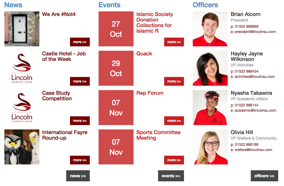
As you can see, the Lincoln Students Union website is a little muddled. The layout and formatting is inconsistent in places, and even unfinished on one of the pages.
For a mobile application, the design will need to be much smoother and more refined, with ease of control in a touch interface also being a key touchstone. The colour scheme and logo design are already strong, however it is the formatting that needs revitalising. With this in mind, I have put together some very rough early stills for what the app might look like.
Given that most applications start with a basic splash screen that animates into the main menu, I have put together what different splash screens may look like.
All the designs have taken the swan as the main image, but in different forms. The first splash simply uses the swan alone, whereas the second takes the whole logo including the text and a further enter command. The third and final splash is my current favourite at this moment in time, with the inverted swan on a simple rectangle. Upon loading, the app would then animate through the red rectangle and reveal the menu.
The next step is to begin creating the visual animations that the app would feature.
With the knowledge that the project is now conceptual, I need to ensure that the portrayal of my design and concept is achieving its potential. For this to become a reality, I have researched how successful mobile products are marketed and presented.
The recent launch of the new iPhone 6 and 6+ came with a new wave of promotional material for the iconic mobile brand. Given the international scope of Apple, their advertising campaigns are curated for specific locations. The following advert I have chosen to pick apart for the project is from the US campaign, entitled 'Duo'.
The advert stars Jimmy Fallon and Justin Timberlake, with their unique spin on the famous 'Thus Spoke Zarathustra'. The audio for the ad is quirky and silly, utilising the fame of its stars to validate the product. Whilst celebrity endorsement isn't something I have access to, the concept of having a fun and lighthearted audio for the conceptual promotion is certainly in vogue when promoting online material. I will address mobile advertising audio in more detail later.
As you can see from the advert, the visual theme is incredibly minimal, with a pure white finish, almost sterile in appearance. This complete lack of any background, not even gradient, ensures the focus of the viewer is entirely framed on the important imagery of the phone and the screen. When the device is not being directly interacted with, the fingers and hands of those holding the phone do not obscure the view in any way, making sure there is no way to miss anything the screen may be showing.
From a design perspective, the clocks and times displayed on the phone in every shot is continuous, always displaying 9:41 am. The phones are almost always being held perfectly horizontal or vertical, there is no deviation, giving the ad an air of perfection and clinical excellence. Maintaining an easily visible and stable presentation of your product is key when promoting smaller technical products.
Moving on from Apple iPhones; Tile.
Tile is an app created to help its user find lost items. Placing a small tile on your belongings means their location can be tracked from the companion app, ensuring users can locate misplaced items. Utilising cloud technology, other users of the app can help locate items that may have been stolen, or when they are out of the range of the owner.
Whilst the premise of the product is interesting, it's the presentation of the product and its ancillary devices that I am most interested in.
Again we see a very clinically designed website (thetileapp.com), much akin to the nextr website, in a single column format. The website features a number of sections each with a different focus of information regarding the products, with further information available on subsequent pages. The following screenshot summarises the design ethic that has been applied to the products physical design, but also its promotional media.
Given these prime examples, both strongly utilising minimal design with the popular whitewash theme, it seems like there is a dominant design style when it comes to promoting products within a screen based medium.
Following some investigation into the coding and programming process for mobile applications, it seems like a more viable approach to develop the app from a conceptual perspective. This will involve completely designing the app from a visual perspective, rather than making an actual application, and then generating appropriate imagery to support the promotion of the application. Given this change in project style, the concept will need to push the boundaries of app design much more than before.
http://www.nextr.info/ is a website promoting an app for travel around Germany. The website itself has a smart layout, with interactive elements to enhance the experience the user has whilst visiting the site. Mousing over certain areas of the website brings up additional information or alternate screenshots. Using this method of presenting screenshots allows the user to customise their experience with the product in an online space, rather than presenting a predetermined video, with timed transitions. Having a smart and intuitive website suggests to the user that the product being advertised may also have similarly strong design and dynamic user interface, and subsequently works as part of the advertising itself.
Below you can see a portion of the website, including the additional information icons (+). The website also has an ingenious way of representing the transition from page to page within the app, placing two screens side-by-side and simply placing a directional arrow from one screen to the other. The arrow also shows the part of the app that has been selected to propel the user to the next page. This method of representation smartly sidesteps the limitation of displaying an app in still images.
This minimalist and efficient design is something I will try to utilise in my own presentation of my work, but that's something that will come further down the line. For now, I'm focusing on the conceptual possibilities oft the app which I intend to conceive.
With the app aiming to fill the gap for a students union mobile application, the product will need to meet the needs of both the union and also the students. Keeping this in mind, I will now develop a first draft for the infrastructure of the app.
It's now time for the development of my level 3 projects in Digital Media at the University of Lincoln.
My proposed project for this semester is to create an app to improve the communication between the Lincoln Students Union and the students of the University. Initial oral research suggests that students of the University feel the strength of communication from the Union leaves something to be desired, and an app seemed like the obvious answer in an attempt to rectify this.
Smartphones are now commonplace devices in the hands of most students, and the lack of an SU affiliated app is something I plan to change.
The first step involved looking at apps that have received plaudits for successful and innovative design. Below are screenshots of Yahoo Digest, winner of the Apple Design Award in 2014. The app uses a simple vertical design, with twice daily updates on the latest top news stories. Once read, a story's icon changes colour (much like links on a web browser), with a wheel on the bottom of the front page tracking all read or unread stories.
From this design, I am inspired by the stark contoured design, using strong diagonals to interlace text and images. The user interface is intuitive, with no specific buttons to link from page to page, but rather tapping anywhere on a headline takes the user to the full story. Whilst on a story, swiping left or right will take the user to the next story, akin to turning the page in a physical print book or newspaper.
Another hot style within the design world is tiles, and tiled structures for menus and front pages. Windows Phones, for example, use a very sharp and defined tiled structure for the front page of the phone operating system, which is also represented in Windows 8, the computer OS.
Since the project has been completed, I've had time to think about what went well, and what I would do differently in the future.
Overall, I was happy with the final submission for the project, however there were some things that I could have done better. In all honesty, I feel like I left the animation phase a little too late, meaning that some of the animation was not as smooth or polished as it could have been given more time.
The website was also something that could have been improved, however I didn't feel confident enough to code the website so that it was actually functional. In future projects I will endeavour to learn the skills to be able to actually create the websites, rather than simply design concepts. That said I was happy with the concepts for the website.
Moving forward to future projects, I've learnt the value of time. Spending as much time as possible on the animation, to ensure polish and overall improved presentation, is something I will definitely do. I will also look into the feasibility of learning HTML/HTML5 coding languages to develop my coding abilities and create the possibility of actually writing and creating the websites I want to.
The final stage of the project is to create the concept design for the website.
I knew from an early stage that the website would need to reiterate the design style from the advert, to maintain the illusion until the reveal is made. Using the same grey, and the same vignette around the edges, I designed a front page that would lead the user to 'enter'.
At the bottom of the page I added 'lifelens.com is part of the Arcon PLC', in reference to the Arcons that used to protect the archives in Ancient Greece. This also furthers the appearance that the website is a legitimate product. The 'e' letters are taken from the logo, with the eyelids filled in.
The main page was then designed using the same basis, background and vignette. The 'e' was taken as a motif of the logo to sit at the top of the page, above the text that reads.
'LifeLens is not real.
Do not dwell in the past.
Enjoy each day.
Make life memorable.
Live it.'
The text is all centered underneath an underline, to construct a minimalist stylisation for the website. 'Live it' is in bold, to apply emphasis that this is the main message of the website.
And with that, the website and project is complete. All elements have been placed on a USB stick and submitted for assessment.
With the script, sound and logo all created it was time to animate the advert.
Using Photoshop I designed the artwork that would then be animated in After Effects at a later date. Some artwork was designed from scratch, and others were inspired by clip art style design. Having a consistent, almost cartoon-like, design across the advert will ensure that nothing seems out of place or different.
The screen shot you see above was constructed by combining 3 frames of artwork, using masks in After Effects. The blue, yellow and green scenes were all separately animated, then layered with animated masks to reveal the scenes one by one. This is my favourite part of the animation.
I continued animating the advert in the same manner, keyframing the positional information of the artwork to ensure there was a constant sense of motion and kinetic energy within the piece. Combining all the artwork with the recorded audio and the readily designed logo frames meant the animation came together almost exactly as intended.
After a few weeks of animating and amending all the keyframes and other effects, the advert was ready to be rendered. Once this was completed, I checked through the final film to ensure there were no issues with the render. I fixed a few issues, and rendered again for the last time. The advert was now finished!
Feel free to watch the advert below:
http://youtu.be/tjwzg-wKAus
The final stage of this project will be to design the LifeLens website, which in reality would be the site that informs users that the advert is a hoax, designed to make people appreciate life, and not dwell in the past.