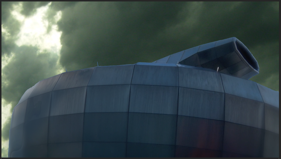
By masking the backdrop and replacing it with a more suitable image, re-colouring the building and applying and more suitably angled lighting scenario, the final piece is much more suited to the style of the show, foreshadowing a dark and ominous story ahead.
The following video shows the layers of development as the piece moved from its original state, to the finished shot.
In more detail, the image of the building was masked in photoshop, then re-animated at the end of the process, since there is no movement required within the image. This saved time on masking the movement of the building, and allowed me to recolour the building with more accuracy and consistency.
By placing the new background and the building layers into a 3D state, I could then relight the shot adding more depth and grunge to the look. Without the lighting the image looks fake, and therefore needs the lighting to enhance the feel and authenticity of the overall outcome.
Without light:
Here are the settings for the light used in After Effects:
Finally, the images were animated to add some movement and dynamics to the shot. Rather than having a short static shot, the movement just finishes off the appearance, creating a visually interesting final product.
Here you can see the finished shot:
Up next is the first of the scenes, which I have received from the production team.


No comments:
Post a Comment