These settings match the settings with which the footage was shot. 20fps isn't ideal, however that's the camera has given me, so that's what I'll be working with.
The first step was to add some colour correction to the footage, to enhance the visual quality. Below you can see where I have increased the saturation and master lightness, as well as adding and adjusting some curves. This adjustment layer has been applied to all of the footage to ensure a consistent overall finish.
After this it was time to motion track the footage, such that the birds can be placed into the scene. Using the built-in tracker function I tracked the motion for all the scenes that I intended to use, and applied the movement to a null object which the birds can be parented to at a later stage. I also added letterbox to the footage, to add a slightly cinematic aspect to the footage. It also gave me some more control over the framing of the footage, allowing me to trim some of the footage under the letterbox.
This shot shows the adjustment layer, letterbox and now motion-tracked bird all applied to the first shot of the animation. The next step is to animate the wings of the birds, and add a flight path across this show. To animate the bird I opened it in a separate composition and began manipulating the different layers.
 |
| Click the image to see an enlarged version |
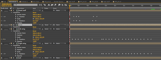
This image displays the keyframes used for animating the red bird. (Note: the composition is called 'birdrast' as initially I forgot to rasterise all of the layers).
Once this had been completed, I added the movement path to the scene in which the bird begins, to add the impression of flight and movement. The animation is quite simple, focusing on using a variety of skills. I also added a CC Force Motion Blur to the bird, so that when it flies across the screen the motion blur can add the sense of dynamic movement.
This process was applied to all other scenes in which it was needed.
For the last shot, the red bird flies in and sits on a branch with the blue bird. For this to work I needed to mask the branch which they were both sitting on, however one small detail was the need to place the feet of the birds over the branch to give the impression they are sat on the branch. To do this I have duplicated the footage, then masked the branch over the top of the other footage, then placed the birds between the footage layers. The image below is a frame from the final scene of the animation, and the orange outline indicates where the mask is.
Since the footage is not static I have had to animate the mash path to ensure that the branch is the only thing masked throughout the footage. The keyframes are shown in the image below.
With this stage of the animation complete, the next stage will be to complete an animated logo and then to compile all of my work into a digital portfolio in Adobe InDesign CC.


No comments:
Post a Comment