This post will be fairly short, simply showing the sketches and subsequent designs I've made over the past few days.
<Sketches will be added here once scanned>
You can see the development from sketches to final product, as well as slight amendments made to suit the screen. As with before, the best way to view these images is in fullscreen on a mobile device.
The next step will be to create a wide range of screenshots for the various functions of the application, and then construct the animation and promotional material to accompany the final concept presentation.
After a long period of designing and sketching, the homepage has been created. Whilst this is a work in progress and likely to change, it gives you an idea of the visual style and layout that the application aims to achieve.
The best way to view this image is to save it to your smartphone, and viewing it in fullscreen.
The top of the application is strongly inspired by Twitter, whilst the tiled scrolling feed more by Google and Facebook.
Further posts will come showing the design development, as well as more and more pages from the app. Stay tuned!
“It doesn't matter how many times I have to click, as long as each click is a mindless, unambiguous choice.”
“Get rid of half the words on each page, then get rid of half of what is left.”
Steve Krug's concepts on usability are wise words for anyone designing any interactive interface, and whilst his writings were originally in reference to web based usability, the themes and ideas can easily be appropriated for a mobile platform.
Simplicity is frequently referred to as one of the key factors to good interface design, minimalising the potential for the end user to be confused or uninterested. Shortening the journey to information is not considered as important as making sure the journey itself is painless and intuitive. Everything from the wording of available options to the colour of the border on clickable boxes can influence the time it takes for a user to decide whether they want to click through or not.
In terms of the architecture of the application, it is my intention to maintain a visual sense of 'real estate', where imagery and structure is maintained across all of the application. In a practical sense, this allows users to become familiar with navigational aspects of the application as well as developing an understanding of location in relation to other forms of content. If the app was to have the home button in different places when moving from page to page then the end user will experience a very disjointed journey to any content that they desire.
Structurally, I intend to construct a narrow and deep architecture, with real estate similar to that of Twitter for example, with a home button always present, and a small selection of shortcuts at the bottom of the screen. This allows the rest of the screen space to be dedicated to the content of each page, as well as making sure the focus is on the appropriate material. Functionality is something that needs to be at an optimal point for this application to maintain its audience, and therefore each user function should be effortless, much like Krug's views on navigation. For general sub-headings within the application, I have written a short list, and these are current navigational signposts to content, or external sites.
Within each section there will be more content, however these are the headings that summarise their subsequent content in the most succinct manner.
Krug raises the idea that some users prefer to browse first, whereas some prefer to use search functions. I'll need to make sure that both types of user can satisfy their usage trends as quickly as possible from the point of opening the app.
As well as structural hierarchy, there is also the concept of visual hierarchy to consider. Do some menu options command more attention that others? Is the space used efficiently to inform the user about which information is the most important and/or relevant? Ensuring that font thickness, spacing, and even bordering is consistent with the intended portrayal. All these things will come with the design portion of the product, which is already underway.
In summary, getting visual design correct can be a tricky task, however the benefits are massive. If users experience good architecture and design then confidence in the application, brand, or product is instilled, moving towards improving the overall customer satisfaction.
Following on from the previous post, which took a brief look into the current design choices of the Lincoln Students Union, I thought it would be beneficial to the development of our product to look further into these choices and learn what changes need to be made. Optimising the visual aesthetic of the application is a fundamental portion of what ensures users return to an app, thus prolonging the life and function of the product.
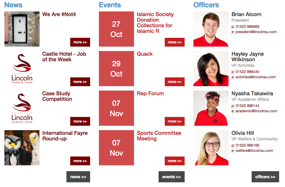
As was mentioned in the previous post, the design of the current LSU website is cluttered and unclear, with a few different styles being employed all in one place. It seems that the presentation of information on the site needs some form of cohesion, to bring together the information in one place with a suitable and functional framework.
Above you can see the current homepage of lincolnsu.com, which in my opinion is all over the place. There's banners, overlays, columns, lists and menus spread out in a poorly organised fashion.
Firstly, the dropdown options for the site run over more than one line, and the website looks poorly made as a consequence. For the application to maintain an active audience, the design needs to be optimal, with no wasted space or untidy finishing.
As you can see above, the menu has a portion of negative space that could be utilised much more efficiently. There is also a selection of menu options that have further options available through menu dropdowns, however there are also some menu options that do not. Uniformity is not something that is utilised enough in the design of this website, and it something that I will be very keen to implement for the conceptual development of the application.
Further into the website, there are pages for information regarding the societies, sports teams and liberation groups available in the SU. The design for these pages is different from the front page of the website, furthering the need for a site wide design style, rather than a range of designs on various pages. Branding is a key issue that a well designed application can help to solve, providing a stable and recognisable product for the students that will use it.
Becomes...
Which becomes...
It feels like the front page, group selection page, and group list page were all designed at separate times, with the final product ending up with a disjointed feeling. This also means the user takes more time on each page to establish what they are looking for, slowing down their navigation, increasing the possibility of losing the interest of the user.
To ensure that these issues are not present in my own work, I will develop a design style across the application, preventing any clashes from article to article or page to page.
As you can see, the Lincoln Students Union website is a little muddled. The layout and formatting is inconsistent in places, and even unfinished on one of the pages.
For a mobile application, the design will need to be much smoother and more refined, with ease of control in a touch interface also being a key touchstone. The colour scheme and logo design are already strong, however it is the formatting that needs revitalising. With this in mind, I have put together some very rough early stills for what the app might look like.
Given that most applications start with a basic splash screen that animates into the main menu, I have put together what different splash screens may look like.
All the designs have taken the swan as the main image, but in different forms. The first splash simply uses the swan alone, whereas the second takes the whole logo including the text and a further enter command. The third and final splash is my current favourite at this moment in time, with the inverted swan on a simple rectangle. Upon loading, the app would then animate through the red rectangle and reveal the menu.
The next step is to begin creating the visual animations that the app would feature.
With the knowledge that the project is now conceptual, I need to ensure that the portrayal of my design and concept is achieving its potential. For this to become a reality, I have researched how successful mobile products are marketed and presented.
The recent launch of the new iPhone 6 and 6+ came with a new wave of promotional material for the iconic mobile brand. Given the international scope of Apple, their advertising campaigns are curated for specific locations. The following advert I have chosen to pick apart for the project is from the US campaign, entitled 'Duo'.
The advert stars Jimmy Fallon and Justin Timberlake, with their unique spin on the famous 'Thus Spoke Zarathustra'. The audio for the ad is quirky and silly, utilising the fame of its stars to validate the product. Whilst celebrity endorsement isn't something I have access to, the concept of having a fun and lighthearted audio for the conceptual promotion is certainly in vogue when promoting online material. I will address mobile advertising audio in more detail later.
As you can see from the advert, the visual theme is incredibly minimal, with a pure white finish, almost sterile in appearance. This complete lack of any background, not even gradient, ensures the focus of the viewer is entirely framed on the important imagery of the phone and the screen. When the device is not being directly interacted with, the fingers and hands of those holding the phone do not obscure the view in any way, making sure there is no way to miss anything the screen may be showing.
From a design perspective, the clocks and times displayed on the phone in every shot is continuous, always displaying 9:41 am. The phones are almost always being held perfectly horizontal or vertical, there is no deviation, giving the ad an air of perfection and clinical excellence. Maintaining an easily visible and stable presentation of your product is key when promoting smaller technical products.
Moving on from Apple iPhones; Tile.
Tile is an app created to help its user find lost items. Placing a small tile on your belongings means their location can be tracked from the companion app, ensuring users can locate misplaced items. Utilising cloud technology, other users of the app can help locate items that may have been stolen, or when they are out of the range of the owner.
Whilst the premise of the product is interesting, it's the presentation of the product and its ancillary devices that I am most interested in.
Again we see a very clinically designed website (thetileapp.com), much akin to the nextr website, in a single column format. The website features a number of sections each with a different focus of information regarding the products, with further information available on subsequent pages. The following screenshot summarises the design ethic that has been applied to the products physical design, but also its promotional media.
Given these prime examples, both strongly utilising minimal design with the popular whitewash theme, it seems like there is a dominant design style when it comes to promoting products within a screen based medium.
Following some investigation into the coding and programming process for mobile applications, it seems like a more viable approach to develop the app from a conceptual perspective. This will involve completely designing the app from a visual perspective, rather than making an actual application, and then generating appropriate imagery to support the promotion of the application. Given this change in project style, the concept will need to push the boundaries of app design much more than before.
http://www.nextr.info/ is a website promoting an app for travel around Germany. The website itself has a smart layout, with interactive elements to enhance the experience the user has whilst visiting the site. Mousing over certain areas of the website brings up additional information or alternate screenshots. Using this method of presenting screenshots allows the user to customise their experience with the product in an online space, rather than presenting a predetermined video, with timed transitions. Having a smart and intuitive website suggests to the user that the product being advertised may also have similarly strong design and dynamic user interface, and subsequently works as part of the advertising itself.
Below you can see a portion of the website, including the additional information icons (+). The website also has an ingenious way of representing the transition from page to page within the app, placing two screens side-by-side and simply placing a directional arrow from one screen to the other. The arrow also shows the part of the app that has been selected to propel the user to the next page. This method of representation smartly sidesteps the limitation of displaying an app in still images.
This minimalist and efficient design is something I will try to utilise in my own presentation of my work, but that's something that will come further down the line. For now, I'm focusing on the conceptual possibilities oft the app which I intend to conceive.
With the app aiming to fill the gap for a students union mobile application, the product will need to meet the needs of both the union and also the students. Keeping this in mind, I will now develop a first draft for the infrastructure of the app.